Data visualization is a crucial aspect of data analysis, allowing users to understand complex information and gain insights from large datasets quickly. Sunburst charts are an advanced and visually appealing tool for representing hierarchical data among various chart types. This article explores the concept of sunburst charts, explains their advantages, and provides a step-by-step guide to generating sunburst charts in Excel.
What Are Sunburst Charts?
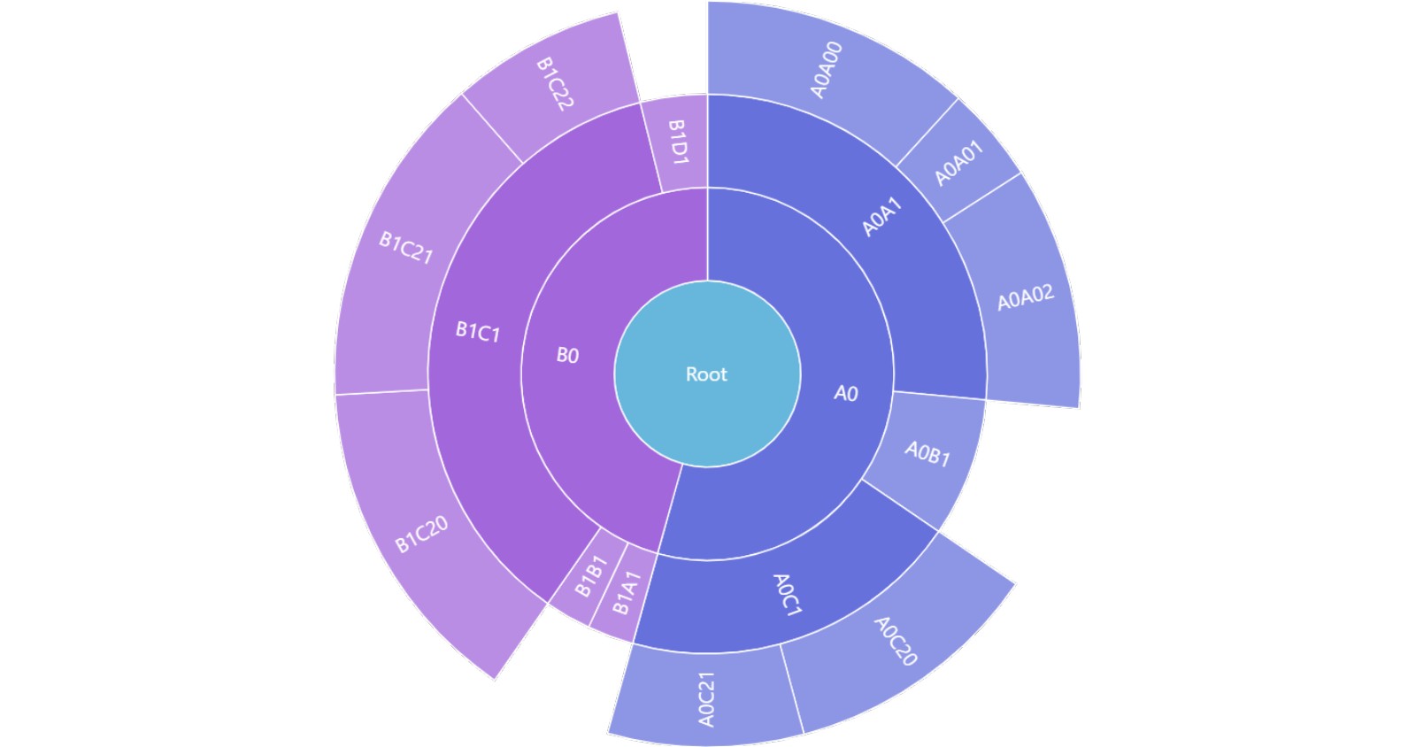
Sunburst charts, also known as “radial treemaps” or “multi-level pie charts,” are a type of information visualization that displays hierarchical data structures in a circular format. These charts consist of concentric circles, each level representing a layer in the hierarchy. The innermost circle represents the “root” node, and each subsequent ring displays the “children” nodes of the previous level. The size of each segment is proportional to the value it represents, making it easy to compare and identify trends within the data. The following is an example of what a sunburst chart looks like:
An Application of Sunburst Charts
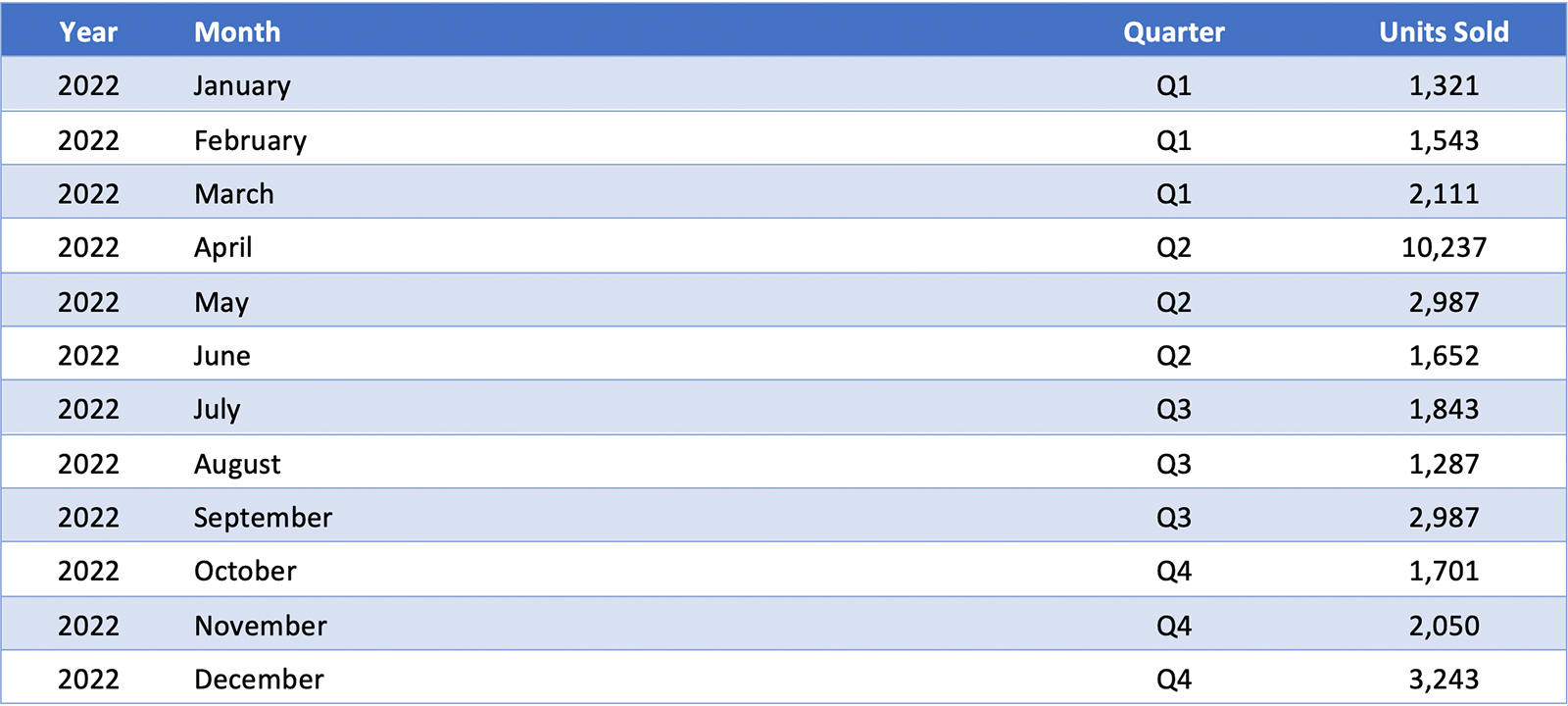
For example, let’s say that a Dubai-based supermarket is analyzing its sales of Vimto during 2022. Data generated from its ERP shows the following:
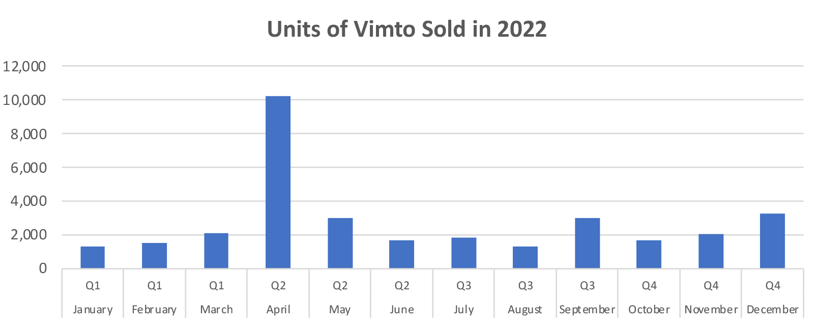
A typical way of visualizing this data is through a bar chart graph:
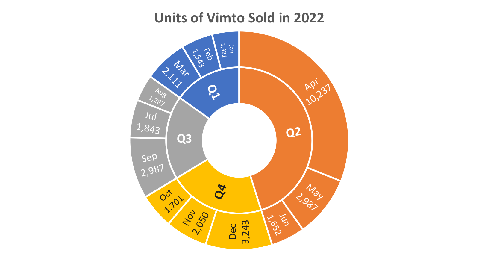
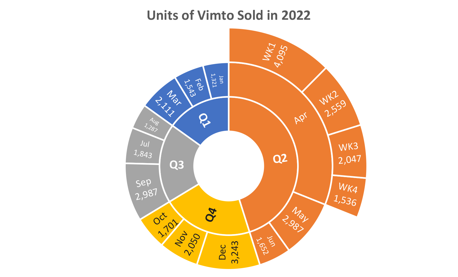
Naturally, more intricate ways exist to show this data (for example, by using vertical/horizontal stacked bars). While this is perfectly acceptable, a sunburst chart is more visually appealing and allows the audience to focus on specific areas of interest. A sunburst chart generated from the ERP data using Excel will look like this:
The above sunburst chart shows that Q2 is the most popular quarter for Vimto sales. Additionally, within Q2, April is the month for Vimto sales in Dubai (can you guess why). Let’s say your manager wants a more granular view of April and wants you to show the sales broken down by week. Going back to the ERP data, you find that the weekly data for April is 4095 for the first week, 2559 for the second week, 2047 for the third week, and 1,536 for the final week. By adding another layer of weekly data (for April only), the new sunburst chart will look like this:
The Advantages of Sunburst Charts
1. Intuitive Representation of Hierarchical Data: Sunburst charts offer an intuitive way to visualize hierarchical data, making it easy for users to understand relationships between different levels and categories.
2. Space Efficiency: Sunburst charts can represent large datasets with many categories compactly due to their circular layout. This makes them particularly suitable for visualizing data with multiple hierarchy levels, where traditional tree diagrams or bar charts may need to be more attractive.
3. Visual Appeal: Sunburst charts are visually engaging, allowing users to quickly grasp the structure of the data and identify patterns or trends. Using color and varying segment sizes can also help highlight specific data points and make the chart more accessible.
Generating Sunburst Charts in Excel: A Step-by-Step Guide
To create a sunburst chart in Excel, follow these steps:
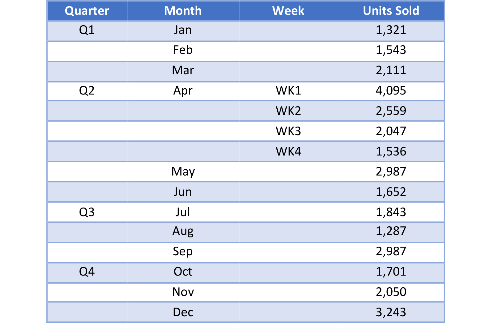
1. Prepare the Data: Ensure your data is organized hierarchically, with each level represented as a separate column in your dataset. For example, the Vimto data needs to be rearranged into the following table:
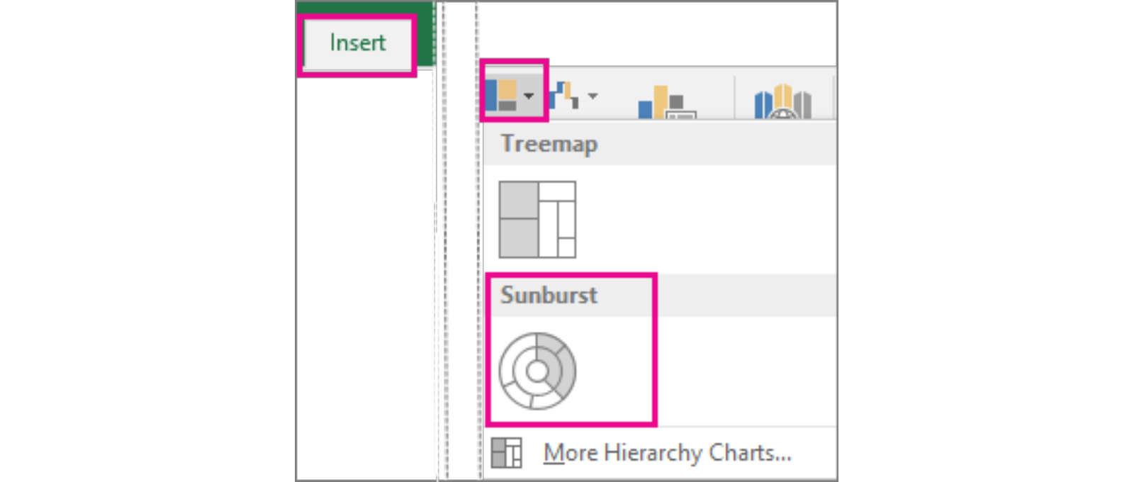
2. Generate the Chart: Select the data you want to include in the sunburst chart. Click insert -> Insert Hierarchy Chart -> Sunburst
3. Configure Settings: Review the generated sunburst chart to ensure it accurately represents your data and provides the desired insights. Adjust the chart settings, such as changing colors or segment sizes, to improve clarity and readability.
Conclusion
Sunburst charts offer an advanced and visually appealing way to represent hierarchical data, making them an excellent choice for analyzing complex datasets with multiple levels of hierarchy. Following the steps outlined above, you can generate your sunburst chart and unlock valuable insights from your data. Like any visualization technique, the key to success lies in choosing the right tool, properly preparing your data, and refining the chart settings to communicate the information best.
 Government Performance
134
Government Performance
134
 Quality and Excellence
128
Quality and Excellence
128
 Supply Chain
340
Supply Chain
340
 Strategy and Institutional Planning
220
Strategy and Institutional Planning
220
 Construction and Infrastructure
109
Construction and Infrastructure
109
 Maintenance and Engineering
213
Maintenance and Engineering
213
 Operations Readiness and Assurance
68
Operations Readiness and Assurance
68
 Engineering and Instrumentation
37
Engineering and Instrumentation
37
 Occupational Safety
69
Occupational Safety
69
 Transportation Management and Aviation
88
Transportation Management and Aviation
88
 Public Finance
229
Public Finance
229
 Public Relations
213
Public Relations
213
 AI in Strategic Planning
14
AI in Strategic Planning
14
 Oil and Gas
50
Oil and Gas
50
 Governance and Compliance
266
Governance and Compliance
266
 Security Management
16
Security Management
16
 Data Management and Business Intelligence
25
Data Management and Business Intelligence
25
 Sustainability
155
Sustainability
155
 Tourism Management
164
Tourism Management
164
 Banking, Insurance and Financial Services
156
Banking, Insurance and Financial Services
156
 Financial Technology (FinTech)
4
Financial Technology (FinTech)
4
 Institutional Leadership
412
Institutional Leadership
412
 Women Only Courses
 Hands-on Automation and Process Control
10
Hands-on Automation and Process Control
10
 Customer Service
49
Customer Service
49
 IT Management and Cyber Security
336
IT Management and Cyber Security
336
 Communication and Writing Skills
29
Communication and Writing Skills
29
 Short Masters
2
Short Masters
2
 Marketing and Sales
163
Marketing and Sales
163
 Graphics & Design Skills Courses
17
Graphics & Design Skills Courses
17
 AI in Customer Service
6
AI in Customer Service
6
 Project Management
182
Project Management
182
 Healthcare and Pharmaceutical Management
258
Healthcare and Pharmaceutical Management
258
 Human Capital Development
263
Human Capital Development
263
 Business Continuity and Crisis Management
6
Business Continuity and Crisis Management
6
 Interpersonal Skills and Self Development
53
Interpersonal Skills and Self Development
53
 Education Management Courses
12
Education Management Courses
12
 Administration and Secretarial
149
Administration and Secretarial
149
 Contracts Management
186
Contracts Management
186
 Digital Innovation and Transformation
17
Digital Innovation and Transformation
17
 AI in Administrative & Secretariat
12
AI in Administrative & Secretariat
12
 Legal
12
Legal
12